Food Photography Tips Based on Our Most Highly Trafficked Recipes
This article was written by one of our summer interns, Erica Pais, a rising senior at Colgate University. As a foodie and Instagram aficionado, she took the initiative and looked at Chicory's top 20 recipes of all time, in terms of traffic, in order to determine if and how photos help a food blog post to go viral. Here's what she found:
In the words of food blogger extraordinaire, Lindsay Ostrom from Pinch of Yum, a great food photo should “pop off the page at people and inspire them to engage somehow with your content.” As a foodie and avid baker that relies on food blogs for recipes, I always gravitate towards pictures that I find enticing...photos that make me say “I NEED to try that now.”
Last month, we published a blog post about attention-worthy Instagram photos, but since starting at Chicory, I have been thinking about what it is that draws me to certain photos over others, so I decided to dig a little deeper into the subject. I conducted a full analysis of our top 20 performing recipes and the associated photos in order to identify common themes and effective tactics for you to use in your posts!
In total, I analyzed twenty posts and their photos, but to give you an idea of the kind of elements I considered, I wanted to share a few of those analyses below.
Strawberry Cheesecake Salad by CakesCottage
Color of Food: Predominantly white with spots of red and yellow
Zoom: Close-up
Shape: Circle (cut-off)
Dishware Color: White
Quantity: 1 unit/photo
# of Pictures on Page: 5 (all the same)
Background Color: Brown (wood)
Writing: None
Action in Photos: None
Steps Pictured: Only final product
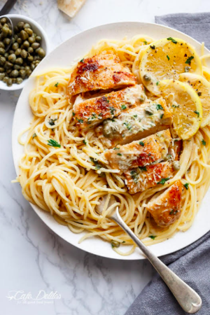
Creamy Lemon Parmesan Chicken (Piccata) by Cafe Delites
Color of Food:Tan, spots of yellow, brown, pops of green
Zoom: Close-up
Shape: Circle (cut off)
Dishware Color: Silver pan & white serving plate
Quantity: multiple servings/photo
# of Pictures on Page: 8
Background Color: White (marble)
Writing on Photo: None
Action in Photos: Spooning on sauce
Steps Pictured: Two individual steps & final product
General Findings: of our top performing recipes...
90% include a neutral background (60% have white backgrounds)
80% are served on either clear or white dishware
70% use a ‘pop’ of color within the dish
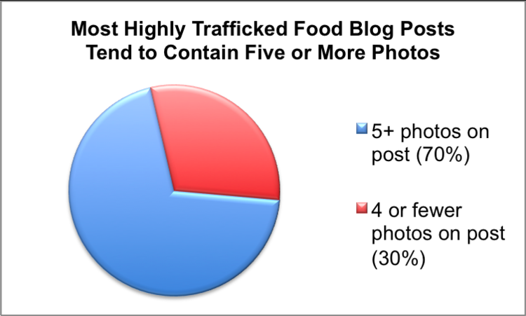
70% contain at least 5 photos of the recipe
70% show only the final product (as opposed to showing various steps)
Remaining Neutral
Of our top performing recipes, most are photographed against monochromatic backgrounds like a white tablecloth or a brown countertop. Regardless of the color of the dish, a simple background makes the food really pop. The same goes for the color of serving dishes. Staging your photos on a simply colored background will highlight what we really care about: the food!
Pop Goes the Color
Focusing on the color of an ingredient can be tough considering we can’t exactly change the color of a carrot. However, do not let your lack of color-changing superpowers stop you! Whether it be a dessert or main dish, the majority of our top performing recipes offer contrasting colors that draw the eye’s attention. Sprinkling a bright, green herb garnish on golden brown, pan-seared chicken adds that extra pop of color that readers love. Similarly, a dark brown chocolate cake is brought to life by bright red strawberries in its center.
Power in Numbers
From the initial research, I was intrigued by the finding that 70% of our top performing recipes display five photos or more. I think this speaks to the power of captivating images. Offering multiple images throughout a recipe landing page constantly reminds the reader that they are working towards a beautiful end product. Visual repetition can help keep readers engaged throughout the entirety of their time on your blog.
It’s clear to see that with food, a picture is worth a thousand words. Keeping the above findings in mind, with thoughtful photo planning and execution, you will leave your readers hungry for more!


